We are proud to announce that our new website has been launched with a fresh new look, easier navigation and a crisp clean logo. We thought you might be wondering what prompted this rebranding of Flou(-e)r so here is a little background as to why we went through this big change.
![]() Why was it time to invest in the design of a new look for flou(-e)r?
Why was it time to invest in the design of a new look for flou(-e)r?
After designing for our clients over the past 9 years, we noticed during the last couple of years our clients were tending to go in a more luxurious direction not only in their design & floral selections, but also in the type of venue they selected. Our previous “look” did not truly represent the work we were doing which was now much more refined and sophisticated. We decided to do undergo a complete rebranding with a design direction that we deemed as crisp, clean & modern but still quite elegant.
![]() What were the goals in going through the rebranding process?
What were the goals in going through the rebranding process?
Our ultimate goal in rebranding was to create a better representation of our image and be a better reflection of our current client base with the ultimate goal of reaching those potential clients that have not yet had an opportunity to experience a flou(-e)r event.
![]() What is this new direction the company is going in?
What is this new direction the company is going in?
Flou(-e)r’s approach to events has changed. We have been honored to be selected to create floral designs for our client’s special event, whether it be a wedding, social celebration, corporate experience or non-profit fundraising gala, but we now offer so much more to the planning experience. We play an integral role in all stages of the planning process from event design & decor to linen, chair and tableware selections to ensure that your event is seamless from beginning to end. We work with some of the best in the industry and look to create a team that will ensure that you host a spectacular event.
![]() What was most important to you in designing your new site?
What was most important to you in designing your new site?
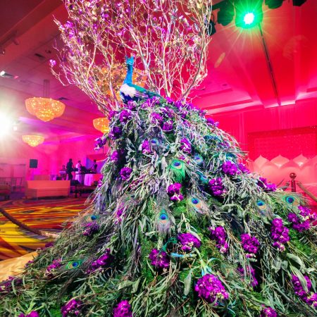
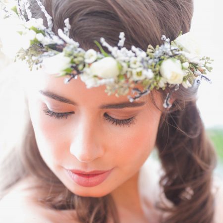
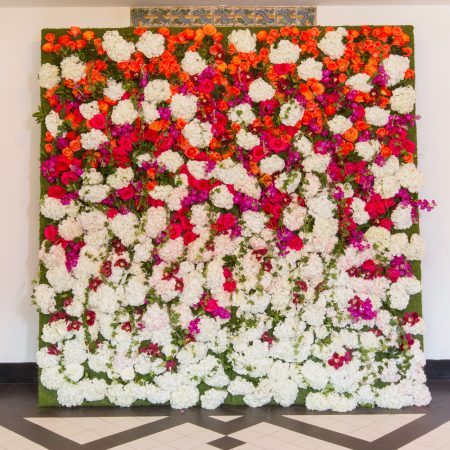
When looking at the redesign of our website, we stepped back and thought, “What gets us charged up and excited when we look at a website? What makes us want to click through a site? What makes us want to leave a site quickly?” The answer to those questions are; a clean & concise look, easy to read and maneuver through and beautiful images that tell a story. Images that capture your imagination and have you wanting more…whether that be a bride’s smile, a flower wall, or a peacock designed out of flowers, there is a story behind each one. If we could create all of the above and also be able to showcase the fact that we have the ability to think “outside the box” in order to exceed our client’s expectations, we would then have achieved our goals of this redesign.
Though we were confident in the direction we wanted to go, we knew from the very beginning that this task of rebranding was not something we could take on ourselves without someone to help us manage the project. After interviewing several branding companies, we knew the moment we meet with Jennifer Iovino from JMI Branding Forward we found our perfect fit. Without her and her team’s help we would have never been able to portray who we are in the light that our new brand represents. We are forever grateful Jennifer, Thank you!!
We hope that you will find our new site to be much easier to use and the overall experience of visiting the site is much more enjoyable. We love our new redesign and hope you do to.


